
Dark Mode inconsistency

Not sure if this is feature request or just a complaint (sorry!).
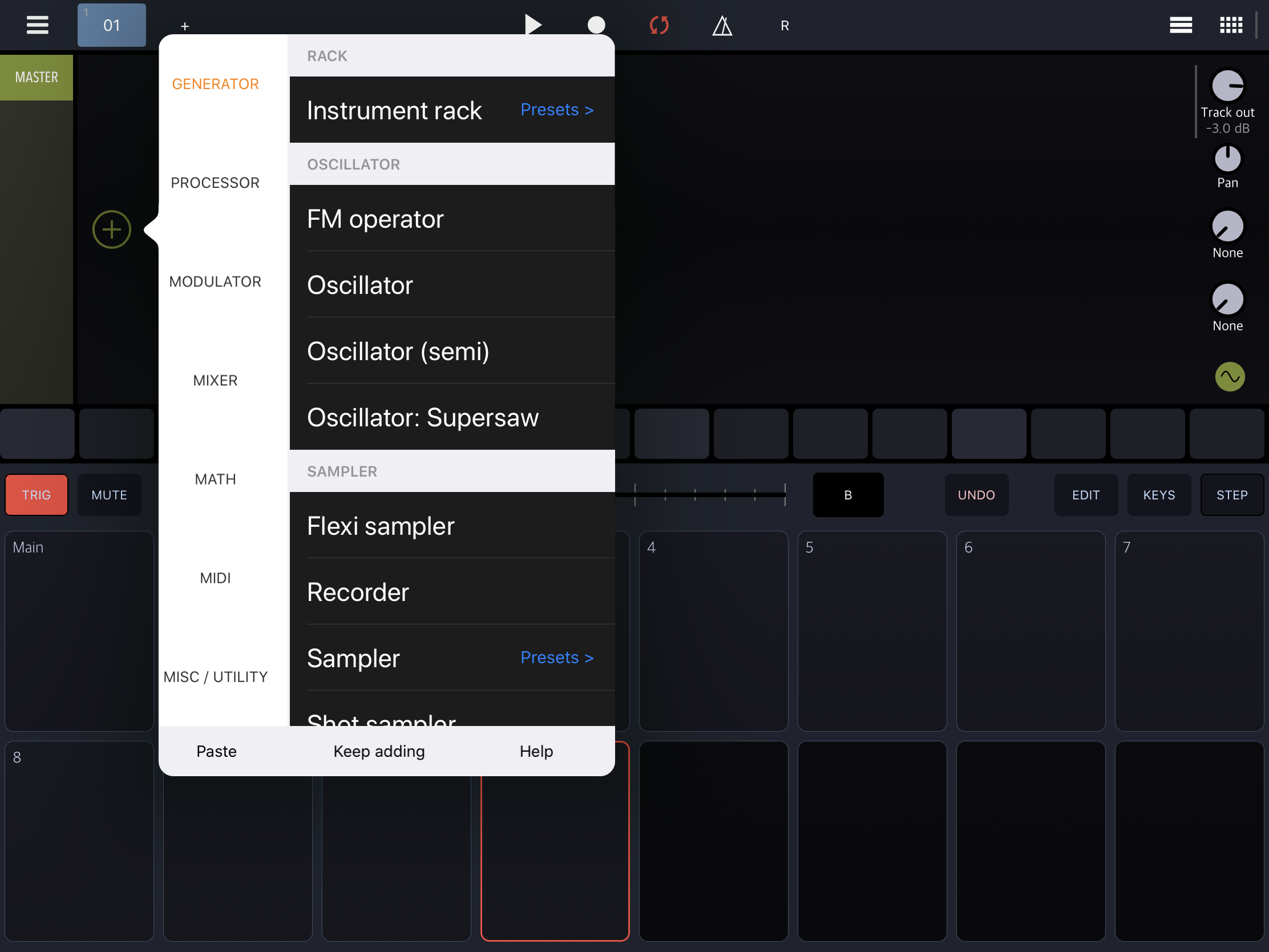
When dark mode is on the module chooser looks like the attached image.
its pretty distracting the way it presents, with the category section still white and only part of the device section switching to dark.
Be better if it just didn’t change for dark mode, or if it did, better color continuity.
Comments
both my ipad and iphone are in dark mode but my drambo is not showing any white like that.
might need a reboot or something? i’m also on the latest os
Hmmmm... I’m on 13.3. I’ll try a reboot. ( who ever turns off their iPad during COVID-19 + Drambo?)
🤣
EDIT: reboot fixed that! Thank you!