
Visual number on step

No visual number on steps is a bit hard when working on long pattern.
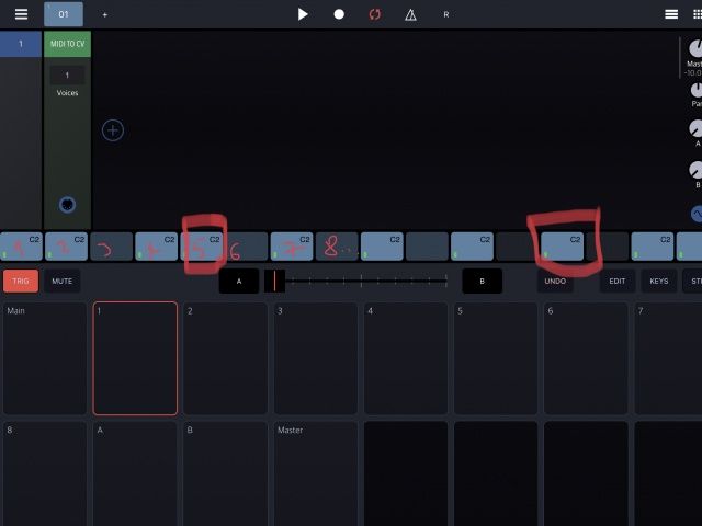
Maybe a different color on Step 1 5 7 13 could improve the reading.. 🤔
No visual number on steps is a bit hard when working on long pattern.
Maybe a different color on Step 1 5 7 13 could improve the reading.. 🤔
Comments
This:
Maybe a different color on Step 1 5 7 13 could improve the reading..
Totally agree with this, except I suppose you meant 1, 5, 9, 13
I wonder if increasing the gap between steps every beat might help. Just a couple of pixels could do it.
Yes for sure. Sorry.
Every 4th/3rd step already has different tint. but yes maybe it needs a numerical indicator like beat number 1,2,3
Maybe try to make it more obvious by increasing the contrast?
And also apply the brighter tint to non-empty steps using a brighter blue, currently they all look the same.
+1 for numbers, i got lost very easily and very often with long patterns
With pattern lengths of 12 beats or above, numbers will become unreadable just like note names.
The display needs additional bar and beat markings, maybe a long vertical line at each bar and a short vertical line for each beat, shown in front of the rspective steps.
These will be visible in all pattern lengths.
What about just rendering a semi-transparent (maybe even user adjustable transparency) step number on the steps behind all the other P-Lock indicators and note/chord stuff dead centre on the step?
+1. Vertical line on bars.
I can see bar lines being more helpful than numbers. Imo subtle visual cues are better than cluttering the UI up.
The thing that trips me up sometimes is having to look over at the page (ie: 1/8) button to know where I'm at in a sequence. Especially when zoomed in. Some kind of visual to help you know your position would help. Maybe that's just me though! 😝